
Our carbon footprint is a simple concept representing the greenhouse gas emissions for which we are responsible in any given year. It is the most useful tool we have for reducing those emissions. As well as giving an overall total the footprint also tells us which aspects of our lifestyle are leading to the largest emissions. We can use this information to plan how we can most effectively reduce our emissions. If we repeat the process in a year’s time it will tell us how successful we have been.
There are a number of carbon footprint calculators on the Internet but which is the best ? The two most obvious criteria for “best” are ease of use and how informative the output is in guiding us to reduce future admissions. A less obvious issue is how easy and comfortable it is to share the result. Encouraging others to join us on the path to net zero is at least as important as taking action ourselves.
I’ve looked at five web-based calculators relevant to the people in the UK.

The WWF Calculator is probably the first to pop up in a Google search. It is also the easiest to use with the most attractive layout. Answer 26 questions, none of which require you to go hunting through your energy bills or trying to work out how many miles you have driven, and it will give you an answer. Most people will work through the process in a couple of minutes.
The result is given along with a comparison with “UK average footprint for 2022”. (It’s a little difficult to understand exactly how they’ve calculated this average, but at least the result is stated clearly). There is also a space for the world average to be displayed but this doesn’t appear to be functional at the moment (August 2022).
The overall result is then broken down into four categories (Home, Food, Travel and Stuff) as percentages of the overall total.
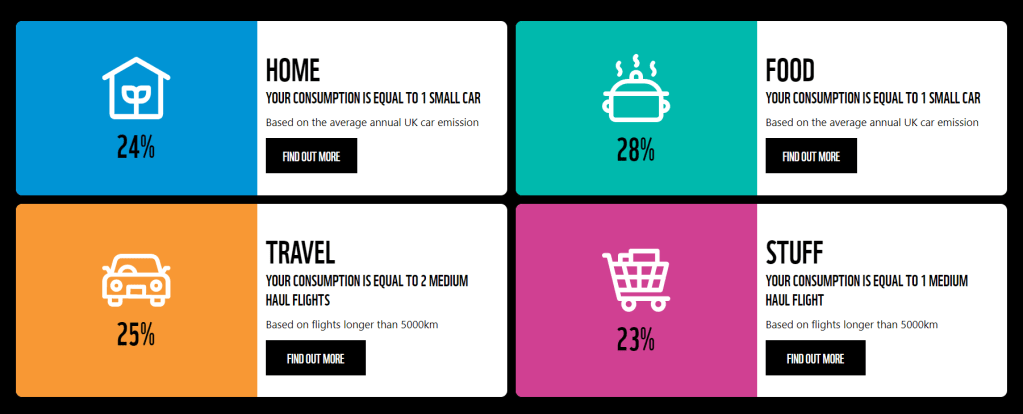
I can’t see a way of getting any more detail. Although this display tells me which broad areas are leading to the most emissions, I can’t find out what, within those areas is most problematic. For example, it won’t give me any insight into whether my “stuff” emissions are high because I bought a new laptop this year or am spending too much on cat food . The “Find out more” boxes go to tips for reducing emissions that don’t appear to be related to earlier answers (I’m challenged to “Eat less meat and dairy” despite me having told the system that I’m vegan already!).
Using percentages to describe your emissions in different areas makes it difficult to follow progress. If I took a couple of extra flights one year and my travel emissions went up then the percentage emissions in other areas would clearly go down without me having made any changes at all. It would be much more useful to have subtotals for the different areas in tonnes as well.
Another issue with tracking progress is that some of the categories for responding to questions are quite broad. Reducing my home heating temperature to 21° to 18° could reduce my emissions by getting on for a tonne but won’t make any difference to my footprint using this calculator which has both temperatures in the same category.
A final issue in this area is that although the browser appears to remember my answers (using cookies?) there is no obviuous way of saving my footprint in order to track progress.
You can share your results on Facebook, Twitter, WhatsApp, LinkedIn and by e-mail with two clicks. There is a version for Android and iPhone.
Summary
This is attractive, easy to use and gives a clear statement of how my footprint compares with the UK average. The breakdown of emissions is very limited and the use of percentage to describe them give little insight into how to reduce emissions or track progress. This is an excellent tool to introduce people to the concept of calculating a carbon footprint. Those who are serious about using the process to plan reductions in emissions and/or to track their progress will need to use a different tool.
Climate Stewards is part of the A Rocha family of organisations and a natural place to look for readers of this blog. They sell carbon offsets and their software thus calculate emissions and what the corresponding offsets would cost.
The interface is more formal than the WWF calculator but still attractive. It does require me to have looked at my energy bills to be able to enter my energy usage and to think a little bit more about the money I spend on a range of things so will take a little bit longer. If you’ve already found out your energy use and annual mileage and are happy to make informed guesses about how much you spend annual on clothes or magazines then it probably takes 5 to 10 minutes to complete. There are some useful pop-up boxes to give guidance in filling in the data.
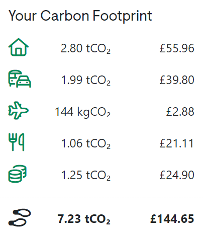
The results are clearly presented in tonnes of CO2 for five areas (flights are listed separately). There is no comparison with a national average or similar so it is difficult to put my footprint in any wider context.
The full power of this site is a little hidden. It isn’t obvious that, having entered my information, I need to click the “Offset Now” button to get a full display of my results (don’t worry you can choose later whether to actually pay for an offset or not). This gives a really clear break down of the different areas of my footprint but also provides drop downs so I can see where, within each of the areas, the emissions are coming from. It might have taken a little longer to enter the data but the detail I’ve got to plan how to reduce my footprint is quite remarkable. I can see, for example, that emissions from my gas use are over ten times those from my electricity use. I’d still prefer a bar chart giving a visual display of the breakdown in terms of absolute values to the pie chart giving % values but that’s me getting picky.
I can’t save the data online, but I can download a really attractive summary of my results in .pdf format (click “Download your footprint”). At the bottom of this is a link to an on-line version (see example) which gives a really attractive way of sharing the footprint. Results can also be downloaded in .csv format which will allow any geeks to transfer their data to a spreadsheet to track progress.
Summary
This is attractive, easy to use and gives a detailed and visually attractive breakdown of my carbon footprint . It takes a little longer to fill in than the simpler calculators and this might put-off casual users but the extra detail that this provides is essential for anyone who is serious about using the results to reduce their personal emissions.

Pawprint encourage people to educate themselves and take actions to reduce their emissions. Their calculator is provided as part of this. To use it I had to create an account and login but this doesn’t take long. It feels similar to the WWF calculator requiring answers to a series of questions. Although there are appear to be fewer questions (20 to the 27 on WWF), some have several parts so there are actually more. There is an irritating delay while each answer is uploaded (at least there was over my internet connection). It probably takes about 5 minutes to complete.
The questions tend to use descriptors (e.g. the options for “Waht kind of electronics do you own?” are “Nothing”, “Below average”, “About average” or “Above average”) which I found easier to relate to than having to estimate how much I spend annually. Electricity and gas use can be estimated on the basis of simple questions or can be added more precisely if usage is known.
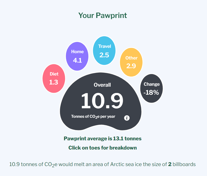
The resulting pawprint is informative and attractive, displaying the overall result the breakdown into four categories. It provides the average from other Pawprint users as a comparison
Below this are a series of horizontal bars displaying the same results against Pawprint averages for the different areas. Clicking on these brings up a little more detail (e.g. clicking on the home bar reveals separate bars for gas and electricity use).
The data is preserved from one visit to the next and if it is altered then the percentage change in overall emissions is presented on the pawprint.
There doesn’t appear to be an easy way to share the results generally.
Summary
This is another attractive and easy to use tool. My feeling is that casual users will prefer the immediacy of the WWF calculator whereas those who are more interested in using the results will find the detail provided by Carbon Stewards more complete.
The inclusion of the Pawprint averages does allow users to put their emissions in the context of those of other users in a way that none of the other tools offer.

Although the Carbon Footprint interface feels a little less refined than that of Climate Stewards, it is extremely similar in design and operation (so similar that it’s difficult to believe that they have been developed independently). Consequently it will take you a similar amount of time to fill in (5 to 10 minutes if you’ve got your energy usage data and car mileage to hand).

The output is a clearly presented and provides a pictoral comparison with the country and world average.
The country average used for the UK (5.4 tonnes) is about half the value quoted by other calculators. I suspect that this is because it is calculated using a different method (see another of my blog posts) in which case the comparison with the results of the calculator will be quite misleading.
The detailed breakdown of emissions is, again, similarly useful to Climate Stewards (but not as attractive).
You don’t have to, but if you create an account you can enter results for mutliple carbon footprints (most obviously for different time periods). This allows you to keep a record of progress but there are no tools for comparing footprints or to download or share results (as far as I can see).
Summary
This is extremely similar to the Carbon Stewards calculator but is less polished and lacks the possibility to download and share results. The ability to store several calculations is useful to track progress and is something that I haven’t come across in other calculators (but would be a lot more useful with some simple tools to visualise changes over time).

Carbon independent doesn’t have the same slick feel as some of the other calculators but it is probably the quickest to complete. There is a single table that you scroll down filling in your answers as you go. If you know your exact energy usage and car mileage, you can fill them in exactly if not you are guided to make sensible approximations.
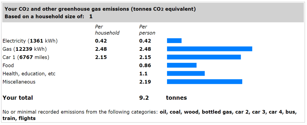
The output is a clear bar stating the your overall total and breaking it down into sensible categories. Although not as detailed as some of the calculators there is enough detail to guide major decisions about where to start cutting emissions. This is the only calculator I have come across which includes a fixed allowance for services such as Health and Education.
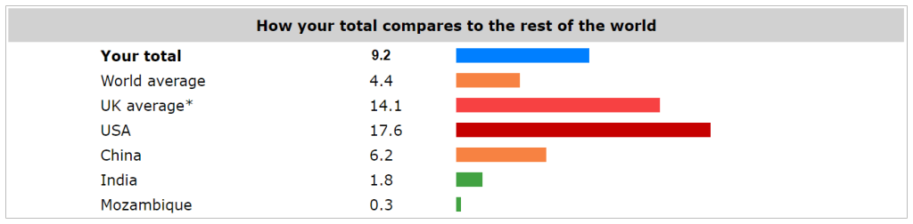
A second bar chart puts this in context of average footprints in a range of countries. Here the UK average seems rather high and, as with the Carbon Footprint, it is unclear whether the results of the individual footprint comparison are really comparable.
There is no obvious way to save, download or share the data but the summary page is designed in such as way that it can be printed out nicely as a .pdf document.
Summary
I really like this tool as hitting a sweet spot between ease of use and value of the information it presents. People who assume that a polished interface is a guarantor of quality may be put off, but there is no reason to beleive that this is any less reliable than any of the other tools.
Overall conclusion
If you’ve got a serious interest in calculating a definitve carbon footprint with sufficient detail to make decisions about how best to reduce your emissions in future, then then the one from Carbon Stewards probably wins out through the quality of the interface and the ability to download and share high quality reports of the results.
If you want a calculator that can give you a quick estimate without you having go searching for your old fuel bills then the WWF calculator is probably prefereable. This is almost certainly the best tool for introducing new people to the concept of carbon footprinting, particularly as being associated with the WWF carries conviction.
One final comment is that different calculators give different results. Over the five calculators my footprint ranged from 7.0 to 10.2 tonnes. This is not an exact science and the different calculators ask different questions and make different assumptions so this is expected and not overly concerning. What is important is that all will give a broad idea of where emissions are coming from and all will reduce if we make appropriate lifestyle choices. We should not, however, compare results from different calculators either for data changing over time for one individual or from different individuals. I’ll go into this in more detail in a follow-up post (this is now available at this link).
Finally, finally, if you use other calculators then do let me know through the comments and maybe I can add them in to this post.
