
The fifth in a series of posts on common but differentiated responsibilities. You can read the first here.
It is not just the science that has developed since 1992. There has also been a revolution in the amount of data that is collected in relation to climate change. At the time of the Earth Summit in Rio there was only a very broad understanding of exactly which countries were responsible for what emissions and this lack of data probably contributed to the rather crude division of a countries as either developed or developing1.
In 1991 the IPCC established the National Greenhouse Gas Inventories programme to monitor emissions from different countries and have subsequently issued a series of increasingly sophisticated guidelines for emissions reporting. The Kyoto Protocol (adopted in 1997 and coming into force in 2005) requires Annex 1 (developed) countries to submit annual Greenhouse Gas Inventories and the Paris Agreement (2015) extends this to all signatories. There is thus now a wealth of highly detailed data on emissions from within different countries which is sufficiently reliable to combine with other international datasets.
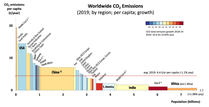
Probably the most useful such combination, as a starting point for a consideration of climate justice, is with national population data to report per capita emissions. In the graph above this is represented by the height of each bar. To the left of the chart are the countries that emit most in respect to the size of their population. These are principally developed countries and those with large (and generally cheap) fossil fuel resources (or both!). Many emerging economies cluster in the middle of the chart where they mix with some of the developed countries that are making progress in reducing emissions. To the left are countries, and regions of the world, where there has been little development and per capita emissions are still low.
The width of the bars represents the population of the country so the relative proportion of global emissions from any country is represented by the area of the bar. Emissions from China are seen to be over twice as much as the second biggest emitter (the USA) but this is a consequence of its much larger population. US emissions per person are approximately twice those from China. Over half the world’s population is represented by the long tail to the right representing underdeveloped countries in South America, Africa and Asia with per capita emissions that are less than half the global average.
One limitation of this approach is that the collated Greenhouse Gas Inventories record emissions from within a country (referred to as production-based) in order to align with protocols for recording other economic measures such as gross domestic product. This can be seen as unfair to countries that manufacture goods for export to other countries as the emissions are allocated to the country in which the goods were made rather than the one in which they are purchased. Fortunately a methodolgy called Multi-Regional Input Output (MRIO) allows for alternative consumption-based emissions to be calculated. These are less accurate than production-based emissions but give a clearer impression of who is ulitmately responsible for those emissions.
Whilst there are some notable outliers2 the difference between the two is quite small for most countries. Either can be used as a basis for a discussion on how common responsibilities for emissions can be differentiated fairly, but consumption-based emissions are a more rational choice for any future allocations.
Read the next post in this series at this link.
- Although the division of the world into developing and developed countries is generally regarded as outdated, the terms will be used here as they are those used in much of the historical literature on which these posts are based. ↩︎
- Singapore, for example, has consumption-based emissions that are more than twice its production-based emissions ↩︎
